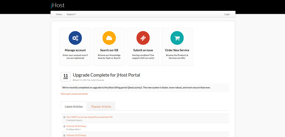
We’ve recently completed a total overhaul and upgrade to our billing portal (jhost.co/my/). The new system is faster, more reliable, and more secure than ever. We’re thrilled. We think our customers will be too.
The upgrade, originally announced on the billing portal itself on April 11th, was slated for completion by the end of April. But, we just couldn’t help ourselves and did the upgrade a little faster than planned. We were just too excited to wait.
Since the beginning of jHost, we’ve used a system called ClientExec to streamline account creation, billing, customer service, and support.
What’s New?
In the latest version of ClientExec (v5.5.x), the frontend got a complete overhaul that made it both more pleasing to the eye as well as much faster by removing bloat, and combining/minifying only the resources needed to power the page the user is on.

There are also a bunch of security patches included, but let’s not get too nerdy.
What Does it Mean to Me?
If you’re not already a jHost customer, not a heck of a lot. If you ARE a jHost customer, then you’ll notice the different once you login to your billing portal. The design is simplified and (we think) much more streamlined. No more modals. No more double-logins. No more loading animations.
It does still have ugly permalinks, but we’re working on that. Many may not notice or care what the address bar in their browser says, but we like nice, clean urls like jhost.co/my/support/ over something strange like jhost.co/my/?fuse=knowledgebase&controller=articles&view=main.
Maybe we’re just web nerds at heart.


